Recent Additions to the Archive

Time for a catch-up on some of the latest things to find their way onto the archive shelves!

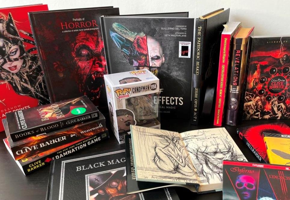
Spanning items dating from 1986 to 2023, the earliest here is an August ’86 sketch that Clive drew inside a copy of the US first edition of The Inhuman Condition.  Other titles here by Clive include new US editions of Weaveworld and The Damnation Game, as well as the Hulu tie-in cover for Book of Blood volume 1.

Large glossy books include Sideshow’s Fine Art Prints, Volume 1 from 2020 (with the Hell Priestess by Ian MacDonald inside) and Rick Jones’s 2022 Portraits of Horror, which has a wealth of horror portrait photography.  These sit alongside Howard Berger and Marshall Julius’s glorious Masters of Make-Up Effects from 2022, which draws back the curtain on a myriad of legends from big screen and small. 

Clive noted in the 2012 art book by Chet Zar (who contributed a wonderful afterword to Imaginer volume 3) that his “extraordinary paintings open an elevator shaft that delivers us down into a world of the purest mystery and dread”. 

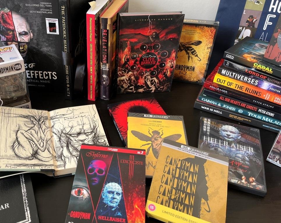
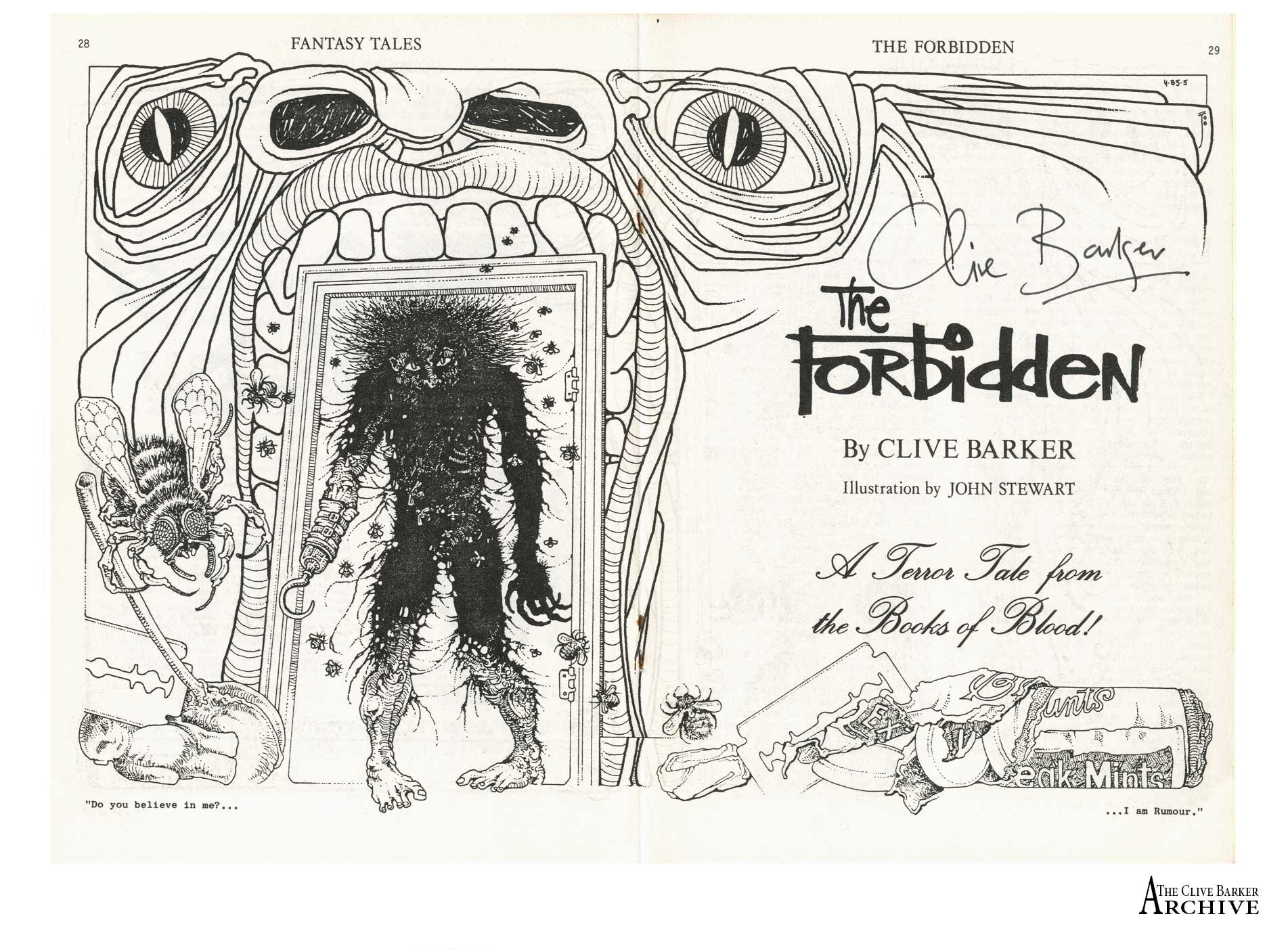
In the back row are the 1999 Italian edition of Revelations (with Clive’s Chiliad), Phantasmagoria Press’s 2022 tribute to Fantasy Tales and we’ve happily laid hands on a copy of The Pandoric Maker’s Magnum Opus – with thanks to Eric Gross. Darkside Books in Brazil continues its fabulous run of hardback editions of The Books of Blood with this third volume from 2022 – with the other three scheduled to follow.

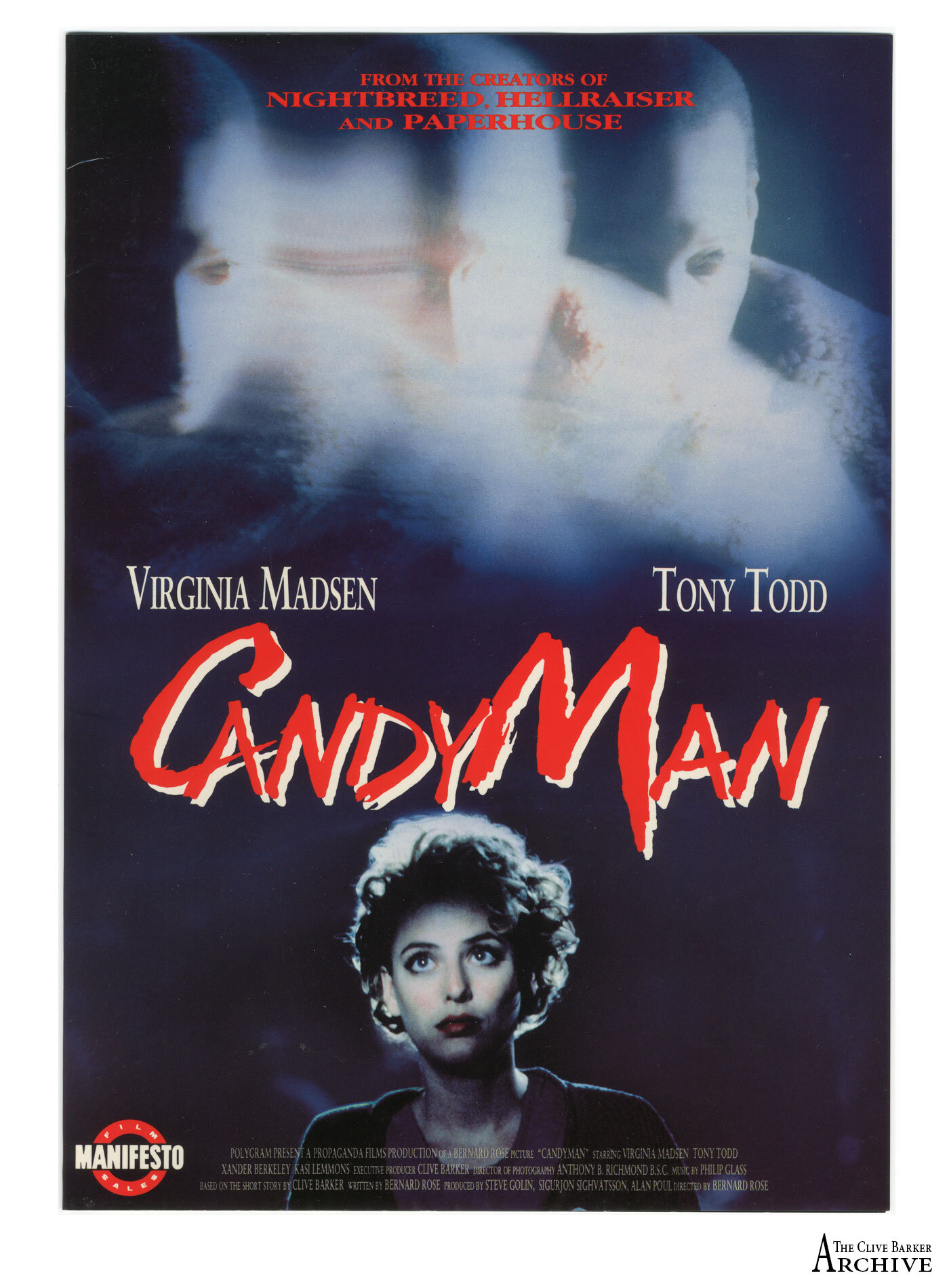
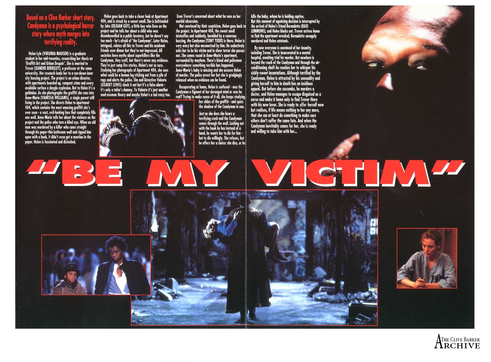
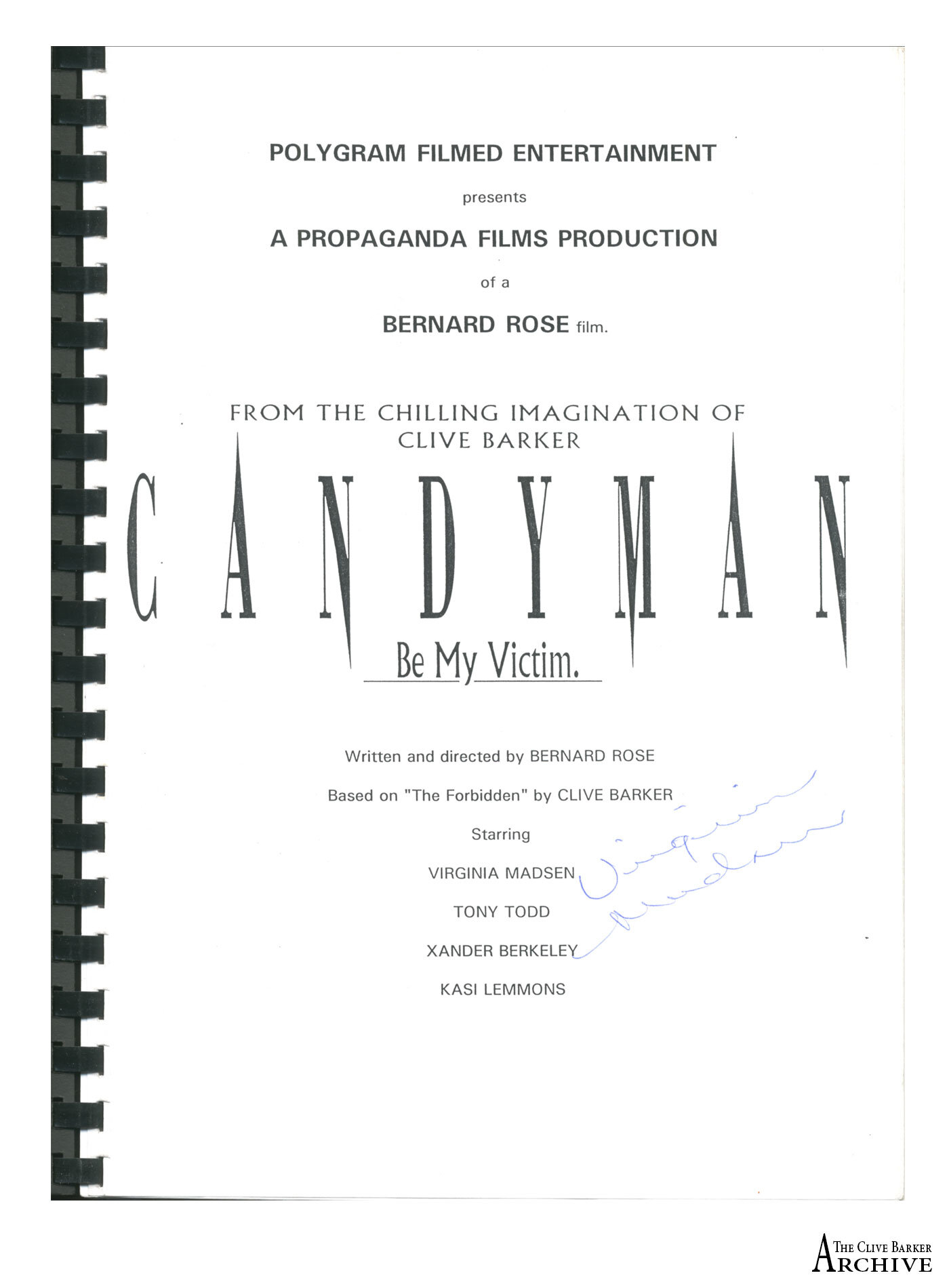
There are DVDs and Blu-rays of Candyman and Candyman 2 from France, Candyman and Hellraiser together (France), Nia DaCosta’s Candyman (France, and a UK steelbook), Hellraiser: Inferno (Japan), and Lord of Illusions and Cabal (Nightbreed) both from Germany.

Clive’s poetry is featured in Multiverses (2023), Out Of The Ruins (2021) and Sorbet Magazine (2019) while other people’s poetry is in the 2015 French edition of Now We Are Sick from Neil Gaiman and Stephen Jones.  Peter Atkins features twice in the pile of books – with a copy of his new All Our Hearts Are Ghosts short story collection that he handed to us over a wonderful lunch together in Los Angeles earlier this year, alongside his Hellraiser: Bloodline screenplay from Encyclopocalypse (2022).   Hellraiser: Hell On Earth is represented by Danny Stewart’s 2021 making of book, War Is Hell.

Two Funko Pop! Figures for the latest Candyman film sit alongside Suntup Editions’s lavish limited Imajica, and a bag with ‘H is for Hellraiser’ in the horror film alphabet.

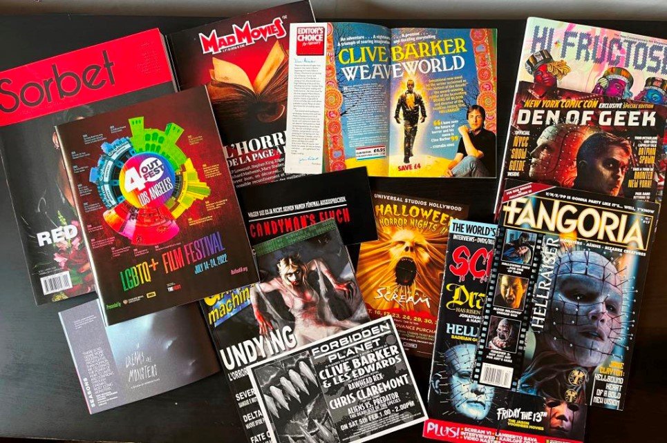
In magazines, Hellraiser has had a swathe of recent coverage and Undying is also represented here on the cover of Italy’s Games Machine from 2001. Clive’s artwork is featured inside Hi-Fructose along with an interview we did for our 2022 release of Clive Barker’s Dark Worlds.

Ephemera includes (with thanks to Paul Doble) Weaveworld in a 1988 World Books Review, a flyer for a 1994 signing at Forbidden Planet in London, and a Universal Studios Halloween Horror Nights II flyer from 1998 featuring Clive’s Freakz maze.  The German Candyman flyer was for press preview screenings in 1992.  The Hulu Books of Blood image was used by Mad Movies in France in 2020 and there are two film festival brochures – for Clive introducing The Director’s Cut of Nightbreed at Outfest 40 in Los Angeles in 2022 and for our on-stage introductions of both Hellraiser and the Director’s Cut of Nightbreed at the BFI Southbank in London in 2022 in the In Dreams Are Monsters season.

More to follow!  

Clive Barker's Dark Worlds

You’ve created a mirror for me to look into, and it’s a bit of a mindblower, frankly, in the best possible way.

Clive Barker

Clive Barker's Dark Worlds

We're delighted to announce that Abrams Books is set to publish Clive Barker's Dark Worlds, a wide-ranging book covering Clive's decades of creative work, as he celebrates his 70th birthday in October 2022.
Assembled with Clive's full input and assistance, drawing on his archive and covering all aspects of his work, this richly illustrated volume showcases a creative life unconstrained by genre or medium.

Phil & Sarah : "We were approached by an editor at Abrams back in the summer of 2020 who wanted to explore the idea of a monograph that covered every aspect of Clive's work. That's quite a tall order but we’ve thoroughly enjoyed drawing on the archive to give new insight (we hope!) into the thoughts and processes behind Clive's creations in a wealth of different media. All in just 300 pages... In the end we had to stretch that to just over 350 pages and at last count we got to over 350 images as well, so hopefully it strikes the right balance between showing and describing just what makes Clive's creations resonate with such a wide audience."

A DEEP DIVE INTO THE CREATIVE WORLD AND PERSONAL ARCHIVE OF MASTER OF HORROR CLIVE BARKER.

”I've seen the future of horror . . . and his name is Clive Barker.”
In the mid-eighties, Stephen King inducted a young novelist into the world of great genre writers, and since then, the genius creator has only continued to expand his field of activity, within and well beyond horror.
Created by his two closest collaborators and with the help of Barker himself, Clive Barker’s Dark Worlds spans his fantastical body of work, highlighting classic characters like Pinhead, an icon in the pantheon of horror cinema; the Hellraiser series; and cult films Nightbreed and Candyman. Barker’s anthology series Books of Blood and epic tales like Weaveworld, Abarat, The Thief of Always, and Imajica have made him a massive name in literature as well as film.
Barker has also created visual narratives for the worlds of comics, toys, and video games, while his art — his incredible paintings, drawings, and photographs, which fill these pages — has been exhibited in galleries all over the world.

Clive is partnering with Book Soup in Los Angeles to offer a limited number of copies signed by Clive. These are available for pre-order with worldwide shipping options now!

Dark Worlds is also available for pre-order from your local book store and via the following retailers:

You can read more of Clive’s thoughts on Dark Worlds, and his ongoing projects, in our latest interview with him on Revelations.

Say His Name...

The best tales get told again and again, and Clive’s short story, The Forbidden, filmed as Candyman and its movie sequels, falls squarely in that slot.

Originally published in 1985 in Volume Five of the Books of Blood, Clive was inspired by cautionary tales told to him as a child by his grandmother.

Marrying common elements and fears - the hook-handed man, castration, the uncatchable killer and urban brutality - the story explores not only the narrative of an urban myth but the very nature of mythology, playing on the fame of a whispered myth as it spreads:

‘I am rumour,’ he sang in her ear. ‘It’s a blessed condition, believe me. To live in people’s dreams; to be whispered at street corners, but not have to be.’

“I was writing about the experience of horror,” says Clive. “This was about why we write those tales, why we hear those tales. The story was about story itself.”

The character of the Candyman draws upon a motif Clive had long been developing since writing his 1973 play, Hunters in the Snow - that of the calmly spoken gentleman-villain - who seduces Helen with the poetry of Shakespeare and the measured rhythms of a lover. Hellraiser’s Pinhead would later share some of these characteristics and be all the more terrifying for it.

“I use a quote from Hamlet in the story: Sweets to the sweet,” he notes. The earlier origin of the quote is Biblical:

Judges 14: 14: “And he said unto them, Out of the eater came forth meat, and out of the strong came forth sweetness.”

“In England, we have golden syrup. The makers of this syrup put on their can a picture of the partially rotted corpse of a lion with bees flying around it, and the Biblical quote…”

The makers of the golden syrup were Tate and Lyle. Clive had named his heroine Helen Buchanan (but Bernard Rose later renamed her Helen Lyle) and the bees and the sweetness coalesced into the story elements.

As Clive notes today, the figure of the Candyman in The Forbidden wears a motley, his appearance is multi-coloured, standing for every kind of ‘other’ - making his universal story adaptable to resonate widely with all who are outsiders or marginalised.

He was bright to the point of gaudiness: his flesh a waxy yellow, his thin lips pale blue, his wild eyes glittering as if their irises were set with rubies. His jacket was a patchwork, his trousers the same. He looked, she thought, almost ridiculous, with his blood-stained motley, and the hint of rouge on his jaundiced cheeks…

And she was almost enchanted. By his voice, by his colours, by the buzz from his body.

The short story is set in Clive’s hometown, Liverpool, and the re-location to Chicago can be credited to Bernard Rose, as he and Clive discussed its adaptation for the cinema. Bernard also added the Bloody Mary element of invoking the titular presence by repeating his name in a mirror and the Candyman, played by Tony Todd, reflected the racial and urban setting of Chicago’s Cabrini Green estate.

[Candyman] was Bernard Rose's baby from the beginning. We shared an agent at CAA and I'd enjoyed Paperhouse - I thought it was tremendous, a smashing picture. Adam [Krentzman] said, "you know, Bernard really likes your short stories and there are two or three he's interested in and would like to get going...”

Anyway, his favourite story was The Forbidden, because he wanted to deal with the social stuff. He liked the idea of taking a horror story with some social undertones and making a movie of it. This was while I was still living in London, and we sat down several times and talked it through. We agreed that it needed to be relocated to the United States because it was American money and they weren't going to be interested in a story set in Liverpool. But the Cabrini Green setting I think worked perfectly well. He took the thematic material in the story and expanded it and turned it into something that was very much his own. I watched over the thing and worked with him and story-conferenced with him and did all those things, but at the end of the day it's Bernard's movie and I think he did a tremendous piece of work.

As Clive noted on the soundtrack liner notes, Philip Glass’ work had an extraordinary impact on the movie:

Philip elevates horror and suspense to an epic plateau. Moving between the gentle toy piano touches of a child's grim fairy tale and the sinister pipe organ of the most fearsome of fire and brimstone sermons, Philip Glass has found a way to evoke the web of the collective fears woven across the span of a human lifetime and lay it like a shroud across an hour and a half of our lives. To this very day, this music still sends chills down my spine.

Shown below and in the Archive Gallery are two pages from Clive’s handwritten draft, this same sequence in Clive’s final hand-amended typescript for the Books of Blood, the artwork (by John Stewart) that accompanies The Forbidden’s first stand-alone publication in Fantasy Tales in the summer of 1985, a 1987 Literary Guild advert for the US publication of Volume Five as In The Flesh, a Manifesto Film Sales brochure from 1992, the cover and title page of Bernard Rose’s film script, signed by Virginia Madsen, and the review and listing of Candyman’s screening at the 1992 London Film Festival.

img-sept2021008.jpg
img-sept2021009.jpg
img-sept2021006.jpg
img-sept2021005.jpg
img-sept2021007.jpg
img-sept2021011.jpg
img-sept2021001.jpg
img-sept2021002.jpg
img-sept2021003.jpg
img-apr2020001alt.jpg
img-apr2020002.jpg
img-sept2021010.jpg

Original Art Release

Clive has released a number of new pieces of artwork for sale and has taken some time to talk a little about each one with us.

The Thinker

The Thinker

The Thinker

“He’s adorable… This configuration, of a head looking – mostly I think off left, as opposed to off right – is something I draw automatically. It’s something that just pleases me, to draw a head, often bald, they’re often very melancholy; they’re never smiling. I don’t know why, they just express something profound to me; somebody looking off into, in this case to the future which is looking off to the right – which to me denotes the future, looking left denotes the past – and clearly the future is not a place that is glorious for him.”


Life Amongst the Barbs

“The interesting thing about painting in abstracts is for me they become representational at an odd point and often I don’t know that they’ve become representational. But this one was an abstract which became a thicket, and has sort of birds’ wings in the design. It seems to me I could imagine that on a cinema screen, moving. It’s not an abstract: it’s a thing which is moving towards representationalism. It’s a hard thing when pictures hover in a no-man’s-land between representationalism and abstraction.”

Life Amongst the Barbs

Life Amongst the Barbs


The Thinker II

The Thinker II

The Thinker II

This is a design. I’ve done a lot of designs recently for a number of projects; there are a lot of projects in the works now. There’s one which I am creating the stories for and I’m also creating the monsters for. I’m doing the same for Clive Barker’s Theatre of Blood with Mick Garris, in fact that’s part of what I’m bringing to them – I’m bringing the narrative and I’m bringing the monster, or monsters, plural. And so a lot of these drawings have that at the back of my head and it would be nice to get some new looks for monsters – and the only way I know to do that is to draw and draw and draw and draw until I find something new.”


Sorrow

“This is a melancholy figure looking towards the past but the stars are there to represent the possibility of a direction, of a pattern – the way somebody guiding a ship would read the stars, so it’s a celestial compass.”

Sorrow

Sorrow


Winter

Winter

Winter

“I think this is almost painfully obvious – when you have that amount of white and bits of colour pushing through, it’s not an abstract: it represents to me snow and ice on maybe branches, obviously falling on natural forms. It’s one of those pictures I think that you could put up and each time you look at it you would see something slightly different.”


A School Friend

A School Friend

A Schoolfriend

“I won’t name the man, the school friend who’s in this picture – he was the smartest guy in my class, I was always second to him and of course we despised each other, but he became a good friend later on… He was the closest I knew, at the age of thirteen, to an intellectual.”


The Hidden Heat

“I think it’s very obvious that blue is cold and red is hot, and the idea of playing with the essential meanings of colours is important to me. I’ve got a very private list of the meanings of colours which I’ve assembled over years and years and years as each new encounter with cultures teaches me something different about what a colour means.

“In certain cultures people go to funerals in white. There are outfits which are worn by the Catholic priests of Spain which look like Klu Klux Klan outfits. In other words, colour and shape can indicate contrary things and so when I’m playing around with something as obvious as blue and white and red I’m looking at cold on the outside, warmth on the inner side and then this stark white of somebody who is probably – what do I mean by white? – I mean a doll, essentially, it’s interesting, I mean a doll. I don’t know how to justify that but I do.

“When I used to make Punches for Punch and Judy shows I always wanted to paint his face white so that the red of the nose, the red of the lips, the red of the cheeks popped, yes? It’s one of the great designs of all time, the design of Mr Punch... a magnificent creation.”

The Hidden Heat

The Hidden Heat


The Corridor

The Corridor

The Corridor

“I love this, let’s call it The Corridor, and offset the name so we’re talking about the right of the picture instead the picture in the middle of it.

“The idea of naming a picture after what seems to be a background detail –not terribly important – but in fact in a Kafka-esque way, indicates something about the world this character lives in. The blue indicates that it’s night outside.

“He’s not a bad man, he’s not an evil man, he’s a functionary – in the Nazi Party he would have been somebody who signed things.”


The John Brothers

“The John brothers came spontaneously onto the canvas – there was no sketch for it, for them. And when I saw it, finally, I really loved them; they seemed to me to offer up endless narrative possibilities because they’re a crowd in one, yes? And it was great fun to be able to do that.

“Now, and I haven’t yet succeeded, I want to find ways to represent that multiplicity in fresh new ways. So I’ve been playing around – there are a lot more images where I’m playing around with the brothers, trying to make them work together.”

The John Brothers

The John Brothers


Suspicion

Suspicion

Suspicion

“This is going to sound very weird… this is a sort of pretended self-portrait – if I had the power to grow a beard of any great density.

“Because this is a very suspicious man. He’s a suspicious man and that’s what I’ve become, that’s very consciously drawing how I feel in that.”


Underwater Surprise

“I love drawing fish. I love it! Do you know why I love it? I love it because they’re essentially a three-dimensional image in two. I don’t like round fish; I would never draw a shark, but watching, particularly, reef fish with their incredible multiplicity – there is either a lake or a sea – maybe you know it – where there’s a particular kind of fish which has multiplied and multiplied and multiplied, in almost endless numbers of variations. The Cichlid fish in Lake Tanganyika. It’s like having butterflies, no two are alike!”

Underwater Surprise

Underwater Surprise


The Assassin

The Assassin

The Assassin

“He has striking eyes, almost Peter Lorre eyes… the point being… I don’t know what to say about it.

“Sometimes people that I paint are presences – they’re proactive somehow or other – this is an absence. Is he good or bad? I have no idea. I imagine his eyes are watery, he’s only just present.

“I don’t trust him, at all! I think it might be the blue hair that does that…”


Design For a Beast

“This is a design for a Beast. There are lots of Beast designs from The Beauty and The Beast, yes? Obviously there’s Marais’ heroic Beast but there’s another one which was done in the nineteenth century which had the Beast as a hog: Walter Crane illustrated that edition and it was gloriously strange. He had a single glass to his eye like a monocle. There’s a magnificent image, it’s a double page and he’s wearing this red outfit which you would recognise as being a foxhunting outfit and he’s sort of immense and he’s a boar in both senses of the word and because he fills the double page almost to the limits of the page he seems overwhelming in the illustration. He’s just a magnificent thing. Crane was a genius and what’s interesting about that is how decorative the picture is, it’s full of pattern, but it’s deeply intimidating to my eye.”

Design For a Beast

Design For a Beast


The Shriek

The Shriek

The Shriek

“This is an interesting one in that I was doing the idea of having blotches of colour on monsters the way that, say, dogs have botches of colour? Like a cocker spaniel that has white and brown and black? And then I was thinking, what happens if we go for really odd colours like brown and blue? And I found that I really liked it; I liked the idea – and I think this is an Abarat design as I’m now coming back into doing those last two books. I have a lot of paintings to make and I can’t go in the studio, can’t make them the same way, so a lot of experiments are coming along.”


Ruins

“I love this. The city is based upon Stalingrad. 1942: the Germans go into Russia and they stop at Stalingrad, they can’t get any further. Winter is coming on and the German army is about to freeze to death; the Sixth Army is about to freeze to death, while destroying the city which is named for the premier of Russia, Stalin. That’s why Hitler actually had to take it down; he sort of destroyed his own army by seeking to destroy a city which was named for his enemy – and I’ve always found that very potent. It’s hubris of the most extraordinary kind. And so images of Stalingrad are things that I play with a lot – every time you see a ruined city it’s likely to either be something in the Mediterranean or Stalingrad, the opposite extreme to the warmth and sensuality of the Mediterranean. This is definitely a Stalingrad derivative. And it allows me to go back into one of the things that fascinates me so much: the Second World War has always fascinated me; it’s there at the beginning of The Damnation Game, even though it doesn’t last very long, and I want to write about it a lot more.”

Ruins

Ruins


Nonchalance

Nonchalance

Nonchalance

“The jacket in Nonchalance is a reference to James Dean. James Dean was fond of those – are they called college, varsity, jackets?  With a number or a name on the back.

“They come in the most extraordinary colours, colours which would even be thought to be perhaps a little effete if they weren’t worn by footballers. 

“So ‘Nonchalance’ is the thing, you just hang around looking handsome!”

All the pieces above, together with a small number of sketches, are available for purchase in the store now!

Oh - and we’ve also made some new additions to the mounted Imaginer plates selection - those can be found in the store too, under ‘Posters and Prints’.


Artwork - from Abarat, Imaginer and more

Abarat - The World Walks

Abarat - The World Walks

Last week, as he prepared to release a number of original works on paper for sale through the Archive, Clive talked us through each piece and their stories, giving some teaser information on Abarats 4 and 5 and confirming the Theatre Of Blood television project with Mick Garris along the way.

You can check out the full interview over on the Revelations site and see the available original artwork in the archive store.

At the more modest end of the price scale, however…

Just occasionally, there’s a hiccup in production and an Imaginer art book arrives here that doesn’t quite make the grade. Rather than send it back to be shredded (!) we’d rather make any (perfectly printed) plates available to grace someone’s home. So we have a number of mounted Imaginer plates for sale, making a great way of having Clive’s art up on your walls - or for gifting to lucky friends!

You can find more details of the currently available selection in the archive store now.

Mounted Imaginer art platesNB: plates each come with a card mount, as shown, but the fully framed one (centre) is just for illustration

Mounted Imaginer art plates

NB: plates each come with a card mount, as shown, but the fully framed one (centre) is just for illustration

Recent Additions to the Archive

Time for a periodic look back at some of the things we’ve added to our shelves here in recent months!

Recent arrivals at the Archive

Recent arrivals at the Archive

Foreign editions of movies include recent releases of Nightbreed and Lord of Illusions in France as well as older VHS releases of Hellraiser III and Candyman from Hong Kong and South Korea respectively.

Guy Astic, who also appears in the French Lord of Illusions Blu-ray extras, has two books of essays on horror, featuring Kirsty and the Chatterer on the cover of volume one.

Amongst the magazine format publications come two career overviews of Clive’s work - in the French Mad Movies and the Italian Nocturno - while Candyman features in HorrorHound and Shock Horror. Lire magazine in France interviews Clive whilst Darkside Books continue publishing beautiful editions of Clive’s titles with The Forbidden and the first Books of Blood volume from Brazil.

Scared Sacred is a collection of essays on religion in horror films published by House of Leaves Publishing and sports a foreword by Doug Bradley.

A couple of photos from the August 1995 Los Angeles premiere of Lord of Illusions sit alongside one of the October 1986 cast of the London production of The Secret Life of Cartoons.

Daniele Serra’s new art book has an introduction by Clive and, at the back, Cemetery Dance’s lettered The Damnation Game is an impressive new edition.

The print at the back of Exiled Mummy is one of more than 25 available now in Clive’s Threadless store at https://clivebarker.threadless.com/ along with shirts, mugs and more…

It’s been a quiet year in publications from us and Clive but we have our collective heads buried in a number of projects that we’re looking forward to having more news on in coming months!

The Presence Of This Breath

Just a quick update from us on one of Clive’s ongoing projects…

Whilst speaking on the phone to Clive about his poetry a few days ago, he mentioned how much he’d like to share the sound of the poems as he hears them in his head with others, so we suggested simply recording the call then and there…

So, with apologies for the quality of an impromptu transatlantic call, occasional interruptions from Clive’s parrot Malingo, and the periodic background noise from a neighbour’s hedge-trimming (!), here’s Clive reading just a small selection of the poems which form part of his upcoming collection, The Presence of This Breath.

YouTube link

Phil & Sarah

Imaginer - Shipping Update

674061E6-18B5-44E8-8503-487803D8BEDD.jpg

We’re busily shipping all the pre-orders of both Imaginer volumes 7 and 8 so copies will be arriving on doorsteps around the world very shortly now. Over the next few days you’ll be receiving tracking details and confirmation of shipments as we work through everyone’s orders, but it will take just a little while to fulfill them all, so please don’t worry if you’ve not received a note from us just yet…

Clive Barker : Imaginer Series

Clive Barker : Imaginer Series

This means, of course, that many of you will soon have a complete Imaginer set on your shelves!

A huge ‘thank you’ from us and from Clive to everyone who has supported the project, from the first Kickstarter through all eight volumes. It couldn’t have been done without you, or without the efforts of James Kay at Transmission Atelier and our printer, GPSD.

Some of you have asked ‘what’s next?’ and we do have a number of projects ongoing - more news of those just as soon as we have safely shipped Imaginer copies to everyone. One thing we can share, though, is that we’re working on completing a slim index volume to sit next to your Imaginer collection and make it easier to locate your favourite pieces of Clive’s art.

We do hope you and your friends and loved ones enjoy your collection for many years to come - this is, we’re told, a highly unusual achievement for a modern artist, to have such a concerted collection documented in his lifetime, and we’re pleased as punch to have played our part in bringing this contemporary piece of art history to fruition.

Phil & Sarah

Completing Imaginer!

We’re delighted to reveal the cover art for the eighth and final volume of the Imaginer Series!

Pre-orders are open now and these preferential pre-order prices will rise to retail prices on publication. As always, this volume is available in two editions:

  • the regular edition (limited to 1,000 copies)

  • the deluxe clamshell edition, signed by Clive (limited to 100 numbered copies)

Everyone who pre-orders a book will also receive an exclusive A5 art card featuring art from the Imaginer series, and all copies will also include an A4 mini-poster. We anticipate that we’ll be shipping these out in mid - late March 2020, hard on the heels of book 7, but we’ll update on both books before then.

A huge ‘thank you’ from us and Clive to everyone who’s followed the series to completion - you’ve helped to create a formidable set of books that chronicles a huge part of Clive’s diverse creative world and we hope you’ll enjoy the books for many years to come!

Light, Wisdom and Sound

roman lws jan2020 3a.jpg

Working on projects with Clive, we spend as much time as we can with him in LA as there’s so much more you can achieve in person over a mug of tea than via video calls from here in London!

On our latest trip, we were delighted to uncover a work that had been feared lost in recent property moves…

In the summer of 1993, Clive was commissioned to travel to New York to create a huge painted backdrop in the space of just 48 hours for the opening of the Light, Wisdom and Sound nightclub on West 29th Street. As he says even now, ‘How could I refuse?!’

Together with some helping hands mixing colours for him, he painted Shaman: The Metaphysics of Light, Wisdom and Sound, a huge loose canvas which was hung as a backdrop against the walls of the club. At the opening event Allen Ginsberg blessed the painting with an invocation on its midnight unveiling (see Jill Abrams’s footage here!)

Clive’s clear memories of meeting the great beat poet and a host of interesting characters that night are married with the frenzy of painting something so large in such a short space of time – all of which came to the fore as we unearthed the canvas and unfurled it for the first time in fourteen years, since its appearance at the Zoomen event at the Bert Green Galley in Los Angeles.

Neighbours stopped on the street as we unrolled it, startled by its sheer size and by the vivid colours which have not been dimmed by time, and Clive got to re-visit his painting, astonished by its clarity and the imagery which has followed on into works which he has made many years later.

lws jan2020 IMG_2593a.JPG

(with thanks to Roman for clambering up on the garden wall to get the best angles for photographs!)