Clive has released a number of new pieces of artwork for sale and has taken some time to talk a little about each one with us.

The Thinker
The Thinker
“He’s adorable… This configuration, of a head looking – mostly I think off left, as opposed to off right – is something I draw automatically. It’s something that just pleases me, to draw a head, often bald, they’re often very melancholy; they’re never smiling. I don’t know why, they just express something profound to me; somebody looking off into, in this case to the future which is looking off to the right – which to me denotes the future, looking left denotes the past – and clearly the future is not a place that is glorious for him.”
Life Amongst the Barbs
“The interesting thing about painting in abstracts is for me they become representational at an odd point and often I don’t know that they’ve become representational. But this one was an abstract which became a thicket, and has sort of birds’ wings in the design. It seems to me I could imagine that on a cinema screen, moving. It’s not an abstract: it’s a thing which is moving towards representationalism. It’s a hard thing when pictures hover in a no-man’s-land between representationalism and abstraction.”

Life Amongst the Barbs
The Thinker II
The Thinker II
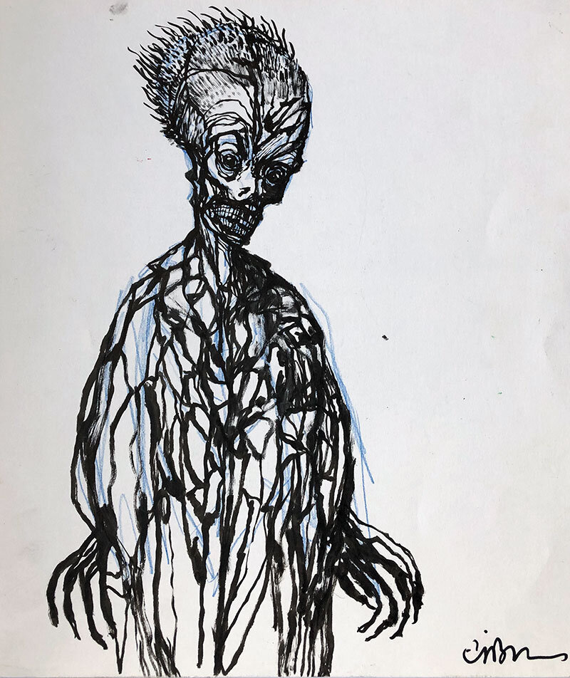
This is a design. I’ve done a lot of designs recently for a number of projects; there are a lot of projects in the works now. There’s one which I am creating the stories for and I’m also creating the monsters for. I’m doing the same for Clive Barker’s Theatre of Blood with Mick Garris, in fact that’s part of what I’m bringing to them – I’m bringing the narrative and I’m bringing the monster, or monsters, plural. And so a lot of these drawings have that at the back of my head and it would be nice to get some new looks for monsters – and the only way I know to do that is to draw and draw and draw and draw until I find something new.”
Sorrow
“This is a melancholy figure looking towards the past but the stars are there to represent the possibility of a direction, of a pattern – the way somebody guiding a ship would read the stars, so it’s a celestial compass.”

Sorrow

Winter
Winter
“I think this is almost painfully obvious – when you have that amount of white and bits of colour pushing through, it’s not an abstract: it represents to me snow and ice on maybe branches, obviously falling on natural forms. It’s one of those pictures I think that you could put up and each time you look at it you would see something slightly different.”

A School Friend
A Schoolfriend
“I won’t name the man, the school friend who’s in this picture – he was the smartest guy in my class, I was always second to him and of course we despised each other, but he became a good friend later on… He was the closest I knew, at the age of thirteen, to an intellectual.”
The Hidden Heat
“I think it’s very obvious that blue is cold and red is hot, and the idea of playing with the essential meanings of colours is important to me. I’ve got a very private list of the meanings of colours which I’ve assembled over years and years and years as each new encounter with cultures teaches me something different about what a colour means.
“In certain cultures people go to funerals in white. There are outfits which are worn by the Catholic priests of Spain which look like Klu Klux Klan outfits. In other words, colour and shape can indicate contrary things and so when I’m playing around with something as obvious as blue and white and red I’m looking at cold on the outside, warmth on the inner side and then this stark white of somebody who is probably – what do I mean by white? – I mean a doll, essentially, it’s interesting, I mean a doll. I don’t know how to justify that but I do.
“When I used to make Punches for Punch and Judy shows I always wanted to paint his face white so that the red of the nose, the red of the lips, the red of the cheeks popped, yes? It’s one of the great designs of all time, the design of Mr Punch... a magnificent creation.”

The Hidden Heat

The Corridor
The Corridor
“I love this, let’s call it The Corridor, and offset the name so we’re talking about the right of the picture instead the picture in the middle of it.
“The idea of naming a picture after what seems to be a background detail –not terribly important – but in fact in a Kafka-esque way, indicates something about the world this character lives in. The blue indicates that it’s night outside.
“He’s not a bad man, he’s not an evil man, he’s a functionary – in the Nazi Party he would have been somebody who signed things.”
The John Brothers
“The John brothers came spontaneously onto the canvas – there was no sketch for it, for them. And when I saw it, finally, I really loved them; they seemed to me to offer up endless narrative possibilities because they’re a crowd in one, yes? And it was great fun to be able to do that.
“Now, and I haven’t yet succeeded, I want to find ways to represent that multiplicity in fresh new ways. So I’ve been playing around – there are a lot more images where I’m playing around with the brothers, trying to make them work together.”

The John Brothers

Suspicion
Suspicion
“This is going to sound very weird… this is a sort of pretended self-portrait – if I had the power to grow a beard of any great density.
“Because this is a very suspicious man. He’s a suspicious man and that’s what I’ve become, that’s very consciously drawing how I feel in that.”
Underwater Surprise
“I love drawing fish. I love it! Do you know why I love it? I love it because they’re essentially a three-dimensional image in two. I don’t like round fish; I would never draw a shark, but watching, particularly, reef fish with their incredible multiplicity – there is either a lake or a sea – maybe you know it – where there’s a particular kind of fish which has multiplied and multiplied and multiplied, in almost endless numbers of variations. The Cichlid fish in Lake Tanganyika. It’s like having butterflies, no two are alike!”

Underwater Surprise

The Assassin
The Assassin
“He has striking eyes, almost Peter Lorre eyes… the point being… I don’t know what to say about it.
“Sometimes people that I paint are presences – they’re proactive somehow or other – this is an absence. Is he good or bad? I have no idea. I imagine his eyes are watery, he’s only just present.
“I don’t trust him, at all! I think it might be the blue hair that does that…”
Design For a Beast
“This is a design for a Beast. There are lots of Beast designs from The Beauty and The Beast, yes? Obviously there’s Marais’ heroic Beast but there’s another one which was done in the nineteenth century which had the Beast as a hog: Walter Crane illustrated that edition and it was gloriously strange. He had a single glass to his eye like a monocle. There’s a magnificent image, it’s a double page and he’s wearing this red outfit which you would recognise as being a foxhunting outfit and he’s sort of immense and he’s a boar in both senses of the word and because he fills the double page almost to the limits of the page he seems overwhelming in the illustration. He’s just a magnificent thing. Crane was a genius and what’s interesting about that is how decorative the picture is, it’s full of pattern, but it’s deeply intimidating to my eye.”

Design For a Beast
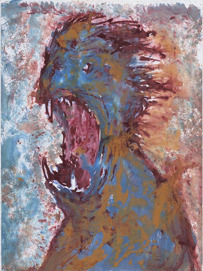
The Shriek
The Shriek
“This is an interesting one in that I was doing the idea of having blotches of colour on monsters the way that, say, dogs have botches of colour? Like a cocker spaniel that has white and brown and black? And then I was thinking, what happens if we go for really odd colours like brown and blue? And I found that I really liked it; I liked the idea – and I think this is an Abarat design as I’m now coming back into doing those last two books. I have a lot of paintings to make and I can’t go in the studio, can’t make them the same way, so a lot of experiments are coming along.”
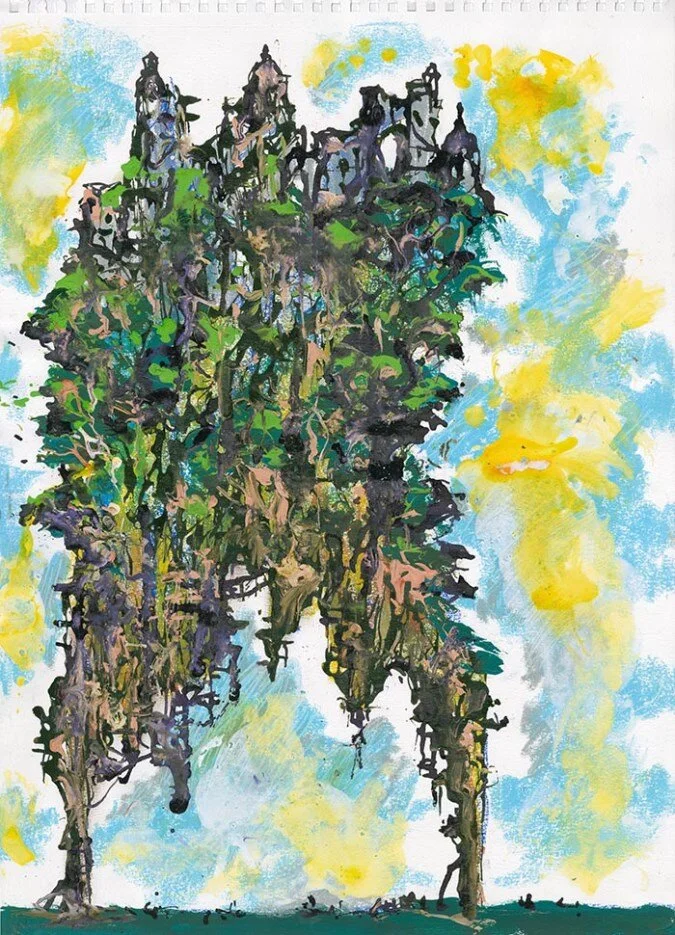
Ruins
“I love this. The city is based upon Stalingrad. 1942: the Germans go into Russia and they stop at Stalingrad, they can’t get any further. Winter is coming on and the German army is about to freeze to death; the Sixth Army is about to freeze to death, while destroying the city which is named for the premier of Russia, Stalin. That’s why Hitler actually had to take it down; he sort of destroyed his own army by seeking to destroy a city which was named for his enemy – and I’ve always found that very potent. It’s hubris of the most extraordinary kind. And so images of Stalingrad are things that I play with a lot – every time you see a ruined city it’s likely to either be something in the Mediterranean or Stalingrad, the opposite extreme to the warmth and sensuality of the Mediterranean. This is definitely a Stalingrad derivative. And it allows me to go back into one of the things that fascinates me so much: the Second World War has always fascinated me; it’s there at the beginning of The Damnation Game, even though it doesn’t last very long, and I want to write about it a lot more.”

Ruins

Nonchalance
Nonchalance
“The jacket in Nonchalance is a reference to James Dean. James Dean was fond of those – are they called college, varsity, jackets? With a number or a name on the back.
“They come in the most extraordinary colours, colours which would even be thought to be perhaps a little effete if they weren’t worn by footballers.
“So ‘Nonchalance’ is the thing, you just hang around looking handsome!”
All the pieces above, together with a small number of sketches, are available for purchase in the store now!
Oh - and we’ve also made some new additions to the mounted Imaginer plates selection - those can be found in the store too, under ‘Posters and Prints’.